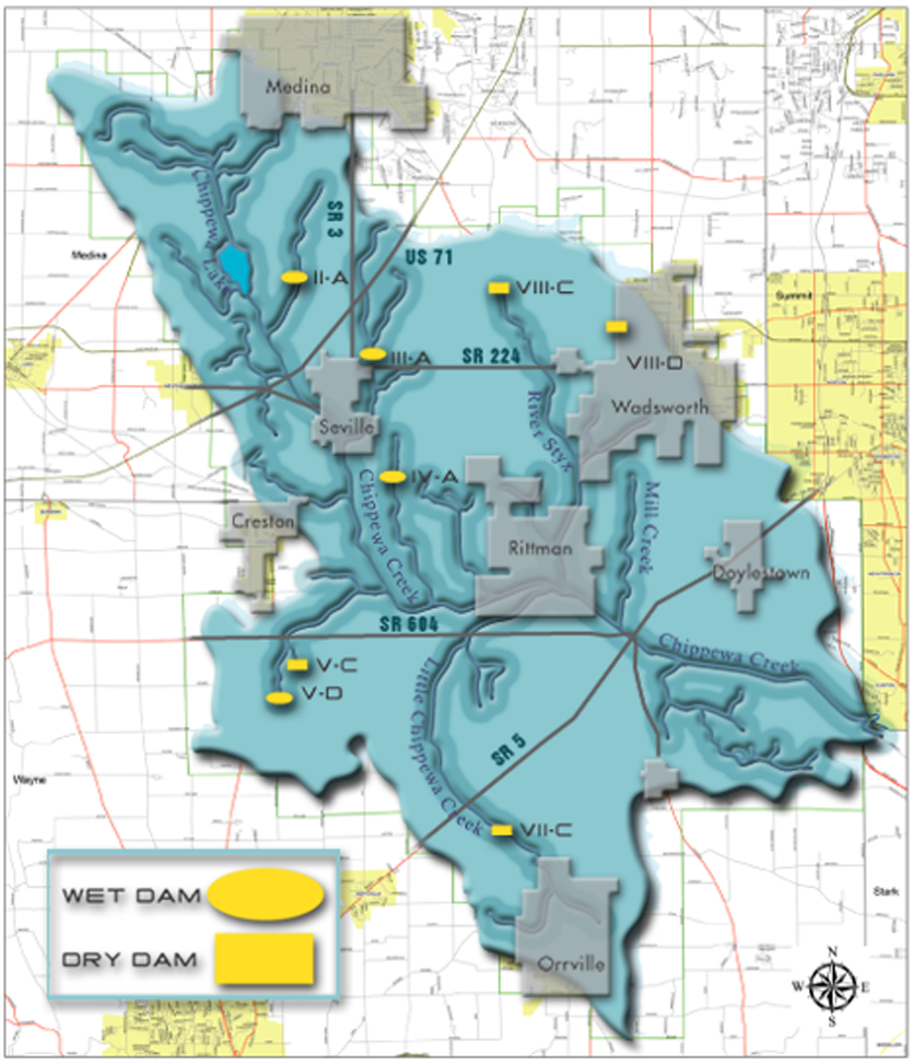
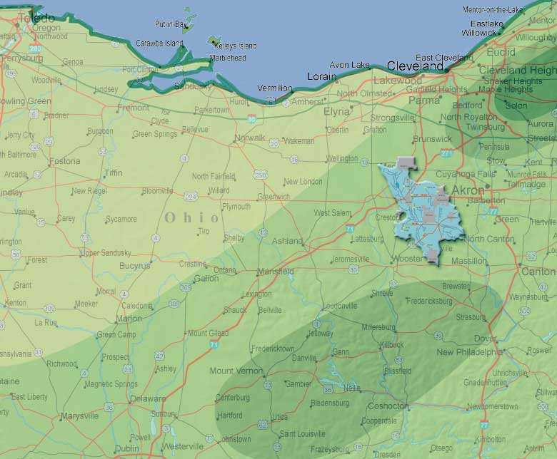
Dating back to the late 19th Century, Ohio has had a tragic history of severe floods. The Chippewa Subdistrict was established in 1960 to manage and maintain the Chippewa Flood Control Project in Central Ohio for the purpose of reducing flooding and periods of inundation.
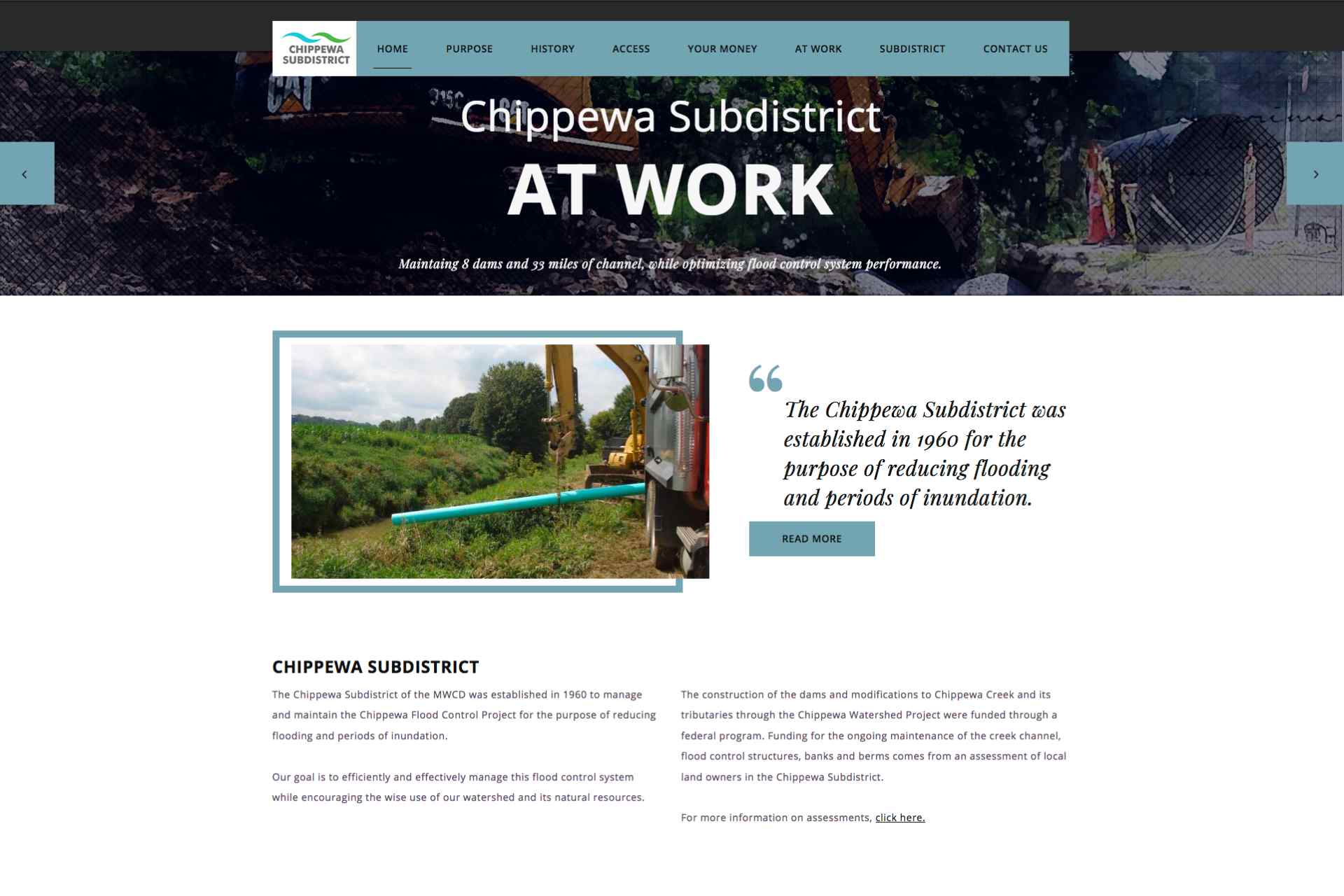
The Chippewa Subdistrict website is a showcase of an extensive engineering project and to address citizen concerns about the imposed tax on properties within the subdistrict. Many of the stakeholders are farmers and landowners who need to see the personal value of the water management solutions and the beneficial economic impact it brings to the community.
This website is the third iteration our company has produced in our 17 year relationship with the Chippewa Subdistrict.
Goals of this project were to show the extent of engineering and construction work both in the design, implementation and maintenance of the Chippewa River corridor.
Project
Highlights
This website integrates the latest features of design, tools and data analysis.
We utilized our prior website data analytic tools to understand how our visitors interacted with our site. We wanted to see if we had enhanced the user experience and improved the targeted metrics.
Goals of this project were to show the extent of engineering and construction work both in the design, implementation and maintenance of the Chippewa River corridor.
Gallery Details
An essential element to show the engineering work was a novel image gallery. We implemented a custom JQuery image gallery to showcase the yearly construction projects. The gallery is able to show both images and project details while being fully responsive.
Technical Illustrations
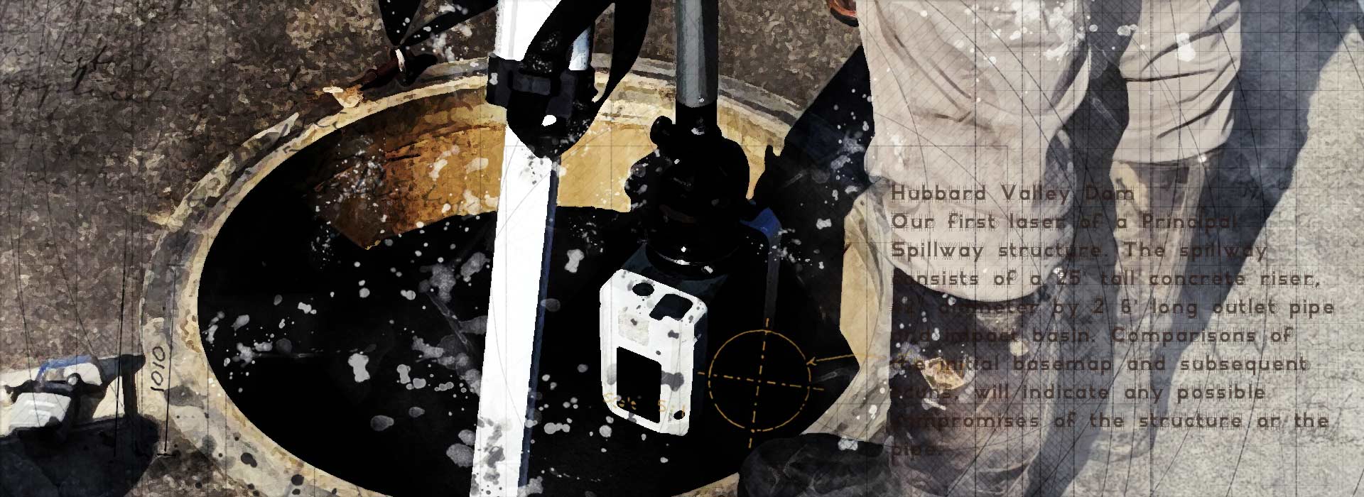
Custom illustrations were created from photographs and populated throughout the website to increase interest and give uniqueness to over 160 pages of content.
Dynamic Assets
Custom scripts in JQuery created motion in dropdowns, sliders and reveals. Dynamic assets has been shown to increase engagement in a website that has over 160 pages.
Notes
Overall, the goals were met. There was increased engagement, time on site, and a lowered bounce rate. From the TrafficTrail™ or heat maps we learned to revise some of the most commonly accessed page content more easily found and positioned.
The percentage expresses rate of improvement from prior website performance, and is not actual visitor data.
DESIGN
To encourage further exploration and increase time spent on website, we used dynamic elements and custom illustrations on many of the pages, to disrupt the "perceived sameness" that often occur on hundred plus page engineering projects.
Design Highlights
Gallery shows technical illustration we created to add some visual interest and appeal to the over 150 page website. Artwork was created as a montage using existing photographs taken by Chippewa Subdistrict personnel and then altered in Photoshop with elements created in Intous, imported and other elements from Illustrator. Photographs were altered in Photoshop and Affinity Photo.
Illustration
Photo Manipulation
A high traffic rate was not the priority, and a high time spent on site was. Content organization or heirarchy showcased the most popular and essential pages first, and highlighted the engineering work when possible.
It was essential that we make the content easily accessible, easily read and achieve a high engagement.
We installed all Google Analytics, Google Dashboard, and HeatMaps and onsite marketing to track and understand customer behaviour on the website. Data was assessed using a/b variant comparisons.
Results recommended adjustments to repositioning of pages content and menu layout to improve visibility of the most frequented pages and articles.


